

股市爆料同學會 is a social media platform focusing on Taiwan stocks, and its APP was released in 2020. Our users were mostly 30-60 years old and had investment experience.

I started to design this product on June 2022. Our team was running on the 2-week sprint, so the following steps would be my design routine.
Our product flywheel was based on the interactions between creators and readers, and our OKRs were consistently aligned with the flywheel.
In this chapter, I will share with you some design cases that I find interesting.


**Note: We have previously found a positive correlation between adding stocks to the watchlist and the retention rate, as users receive more relevant articles that align with their interests.

In our A/B testing, we replaced the 'add to watchlist' icon with call-to-action words and tested the bellowing two variants:

We chose variant C due to its higher CTR and 'Add to watchlist' percentage.
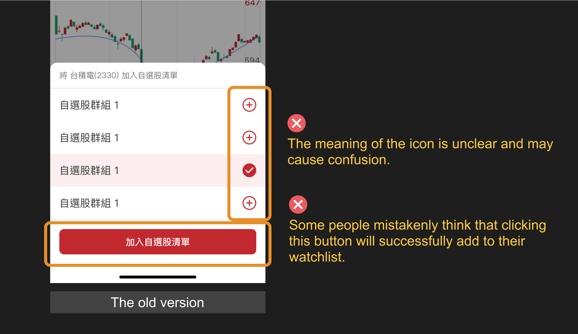
During our usability testing, we discovered that the original “select list” modal made the new users confused.


I took the interfaces of Dcard, Instagram, YouTube, Facebook, and Twitter as references, and ultimately chose Facebook and Instagram for the bellowing two reasons:

Since our plan at that time did not include a tagging feature for names, I combined design elements from Facebook and Instagram to create a version that best suited our product.

4 months after the feature was launched, the average number of comments per user has increased from 12 to 18 (+51%). Moreover, the number of users leaving comments has increased by 6.74%, and threaded comments make up around 20% of all comments.
Our team tried using an explanatory pop-up to encourage users to enable push notifications, but it actually decreased the conversion rate by 4%. I assumed this may be because it required an extra click, which made the process more complicated for users.

Therefore, in the new design, I used animation to highlight the action button, making the call-to-action as intuitive as possible.

For the reports and news article:


During past interviews, users frequently complained about the inefficient and cluttered browsing experience in our APP. Some content creators we interviewed also believe that titles can attract readers to click.
Increase the article CTR.


To prevent some users from abusing the title function and lowering the quality of content, currently, less than 40% of users are able to use titles.We will keep monitoring the data performance to decide whether to lower the criteria.


